Saorie
Client: SAORIE – Sustainable Fashion & Apparel
Role: Lead Visual Identity Designer
Scope: Branding • Packaging • Typography • Visual Direction • Social Media Content
Tools: Illustrator, Photoshop
The Problem
SAORIE was imagined as a conscious fashion label tailored for the Southeast Asian market—where the demand for modest, climate-appropriate, and ethically stylish clothing is growing. The challenge: to create a visual identity that felt soft, elevated, and rooted in regional aesthetics—while still appealing to a modern global audience.
Most fast-fashion or luxury labels in the region either look Westernized or overly traditional. SAORIE needed a brand presence that could balance contemporary fashion values with Southeast Asian warmth and grace.
The Solution
The identity system was designed to reflect ease, elegance, and earthiness. Key design decisions included:
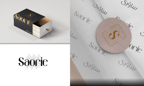
- A delicate, bespoke serif logotype symbolizing femininity and timelessness
- A muted, earth-toned palette inspired by nature, skin, and organic materials
- Minimal, clean packaging with sustainable appeal, enhancing tactile experience
- A gentle typographic system with open spacing to mirror the brand’s breathable, graceful silhouettes
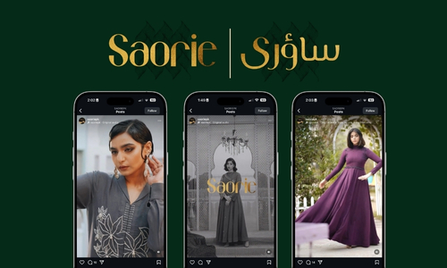
- Social media and editorial assets focused on slow fashion, storytelling, and regional beauty
From fabric tags to lookbook catalogue, every touchpoint was built to reflect intentional, regionally resonant fashion—designed to be worn with comfort and pride.
The Results
SAORIE now stands as a thoughtful brand concept that bridges cultural nuance and global minimalism. The project has been praised for its refined softness, versatility, and how well it visually communicates quiet luxury with Southeast Asian soul.
