
Moppets Poppets
Client: Moppets Poppets
Role: Brand Identity Designer
Scope: Logo • Visual Identity • Packaging • Illustration • Social
Tools: Illustrator, Photoshop
The Problem
Kids’ brands tend to be either too cartoonish or too polished. Moppets Poppets needed an identity that appeals to children and their parents, works across clothing, toys, packaging and digital, and stands out in a crowded market.
The Solution
The identity is built around the quirky personalities of kids themselves.
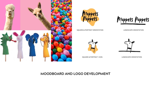
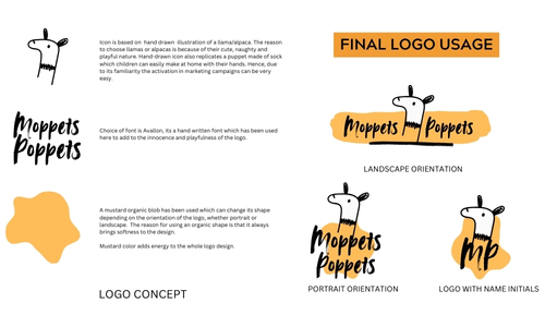
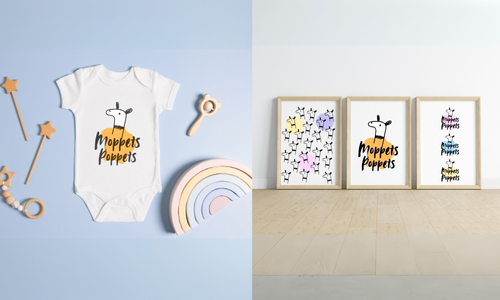
- A hand-drawn llama icon, chosen for its cute, mischievous character. It also looks like a sock puppet kids can make at home, which makes it easy to use in marketing activations
- Avallon, a handwritten typeface, for an innocent, playful wordmark
- A mustard organic shape behind the logo that changes form for portrait and landscape layouts, adding softness and energy
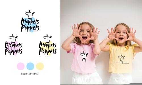
- A gender-neutral palette that skips the default pink and blue
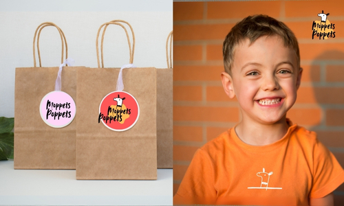
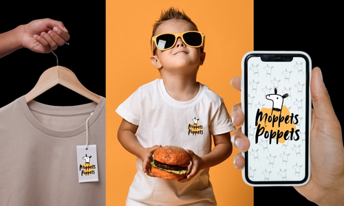
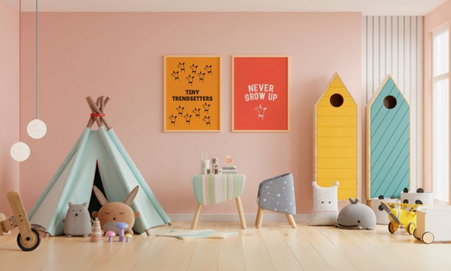
- Character icons and patterns for packaging, labels and web, scaling from a clothing tag to a shop sign
Packaging mockups covered wrapping paper, hang tags, shipping boxes and thank-you cards.
The Results
A flexible identity ready for a boutique shelf, e-commerce packaging and the toy aisle.
Date:
September 7, 2025